For every great rebrand, you can find handful’s of poor decisions led by budgets and poor advice.
As we’ve discussed in previous blogs, rebranding is about more than just a logo change. Rebranding effects who you are a s company, how others portray you, how you illustrate your targets, goals and service. Rebranding is a decision that shouldn’t be taken lightly, and under no circumstances, done on the cheap. That being said, plenty of big companies have coughed up multiple millions to rebrand, when in reality a £20 freelancer could have achieved better results. We take a look at 5 of the worst rebrands of recent years below:

Animal Planet
Animal Planet rebranded in 2008 (along with many other companies). The original logo, showed the channel name, along with animal silhouette and Earth illustration. The new logo ditches the later two in exchange for a Typographic (albeit horrible font) style logo.
Now… Your guess is as good as mine when it comes to working out the look they were going for. The new typeface is irregular in size, weight and colour. This is topped off with an abnormally sized M, laying on its side to fill the void left by placing the initial A over both lines. It’s so poor it’s difficult to explain!
We’re going to assume they wanted the M to look like a snake. I mean, if you turn your head, take twenty steps back, close one eye and squint with the other, you might well see where we’re coming from (or not).
We have to give them credit for sticking to their guns, although changes were made in 2013 where by the sideways M is now replaced with various animal heads. The scope for creativity here was endless, so it’s a little disappointing they didn’t take advantage of it.
Lesson learnt: Keep it relevant. Yes other people may be doing something, but that doesn’t make it right for you. Trends are great but apply them in context.
Mastercard
This is a great example of if you’re going to do something, do it properly. There’s nothing like a half-hearted rebrand to show the world you’re not too sure on your own rebrand either.
In an age where simplicity has become key. Flat Icons and fluff cutting are the growing trends. Mastercard obviously didn’t get the memo. Often voted the worst rebrand of all time, they took a simple, iconic brand and created… well this.
To make matters worse, the company later released a statement announcing the old brand would remain on credit cards, whilst the new logo would only be used on business communications. Come on Mastercard, either stick to your guns and show us why the rebrand was worthwhile or cut ties altogether. This is just confusing.
Lesson learnt: Just because your logo is simple doesn’t mean it’s poor. In fact often quite the opposite. Keep it simple, as you’ll find it easier to implement moving forward.
Cardiff City Football Club
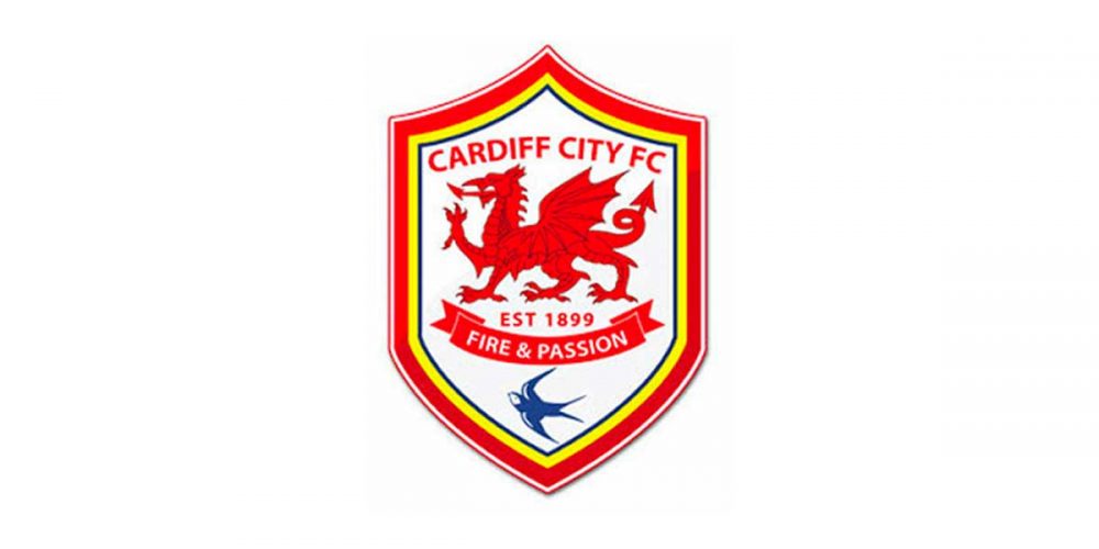
Let’s change a 120 year heritage, to some of the most passionate and loyal supporters in the world? Great idea! In fact, let us change everything, is how we imagine the meeting went when Vincent Tan took ownership of Cardiff City Football Club.
The “Bluebirds” as they are affectionately known, always wore blue kits, had blue logo’s and were everything blue. That is until Mr Tan got his way. Not only did he just move away from the history, he moved as far as possible. Blue became red, the bluebird became a dragon, and it was justified through ties to the Welsh flag (you’re not fooling anyone).
So with the Red Dragons now playing… Wait, what? They’re not the red dragons? No, just to add to the confusion, they’re still the bluebirds. I can think of much better ways to spend £100 million.
Lesson learnt: Rebranding doesn’t mean to go at it from a completely different angle. If you have a strong heritage and tradition, it makes sense to honour that moving forward.
Pepsi
Pepsi always appear to be playing catch-up with Coca-Cola, and if the leaders rebrand, Pepsi are never far behind.
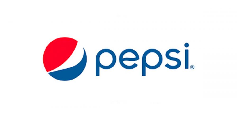
In 2008 they forked over one million dollars to get their logo rotated. OK there was a bit more to it than that, but that’s what people pulled them (or more particularly their agency out). Whilst the new logo was no head turner, and looked like an iteration of it’s previous form, the 27 page accompanying document is what caused the mockery.
We’ve all been there. Under pressure on a project and left scrambling for ideas, none of which you have your heart behind. Where most of us would hold our hands up, that was not the case in this instance. Instead, the agency (who will remain unnamed) tried to explain there design with a multitude of ambiguous comparisons, including but not limited to:
- A smile
- The Parthenon
- The Mona Lisa
- Hindu Tradition
- The Earths magnetic field
OK, we get it. Try and pull the other one next time!
Lesson learnt: Don’t just rebrand because everyone else is, and definitely don’t try and cover your back with a series of whimsical statements.
BP
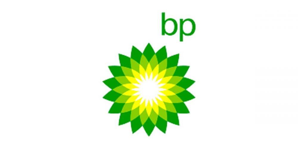
BP’s rebrand went down hill fast. Not so much in design but a mixture of styling and bad timing. In the year 2000 BP introduced it “Helios” logo, replacing the original emblem of 70 years. The colour palette remained but asides from a larger footprint, the design was modern and concise.
What many people were drawn to was it’s resemblances. Whilst BP used the logo to represent their green growth strategy, many were quick to point out that there isn’t much green about drilling for oil. Was this their way of pulling the wool over our eyes?
Well if that was the case, 2010 definitely brought a halt to that. BP were responsible for the Deepwater Horizon oil spill. Largely considered the largest marine oil spill in history. Some drew direct links between the new brand styling and oil spill patterning. Others, in traditional internet fashion, were a lot more creative.
It was rumoured at the time of rollout that costs of the rebrand would be in excess of 200 million dollars. Coupled with the clean up of Deepwater Horizon, the company has some pretty heft bills to fund.
Lesson learnt: If ever you needed proof that your brand is about more than just your logo. Company ethos funnels throughout everything you do, so keep it transparent.
If you are looking to start a rebrand, or maybe want some advice on your current brand, we are more than happy to schedule a call. Simply drop us an email and we will get back to you as soon as possible.


